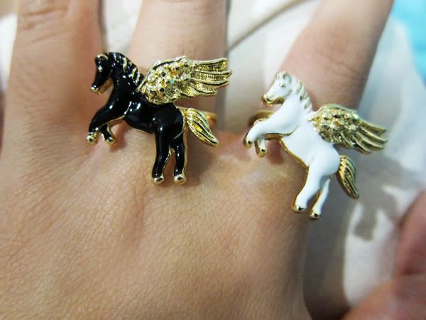
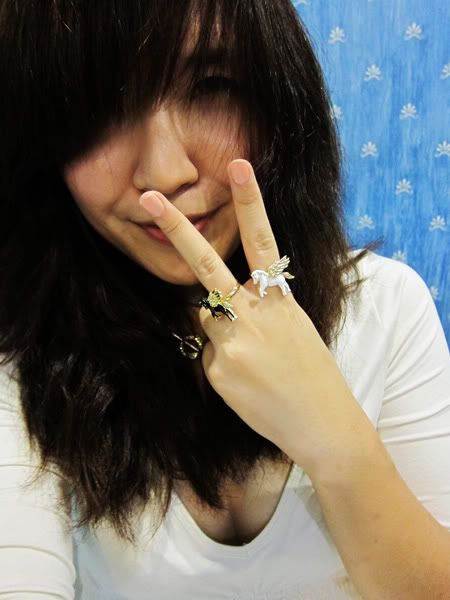
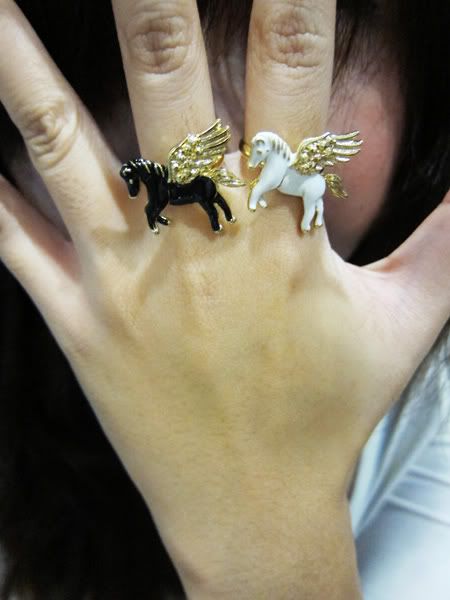
I forgot to mention that the rings are adjustable, so it'll fit everyone! :)
Also, I've one last piece of the chiffon bias hem shirt in black here, go check it out!
Hi guys, I've another giveaway! This time it's two

The consequence of using a semi-pro camera is that your hands flaws are captured and magnified.

Like I've mentioned recently, I've been thinking of revamping this space for sometime. If you notice, I've tweaked my layout slightly, instilled bigger images etc. I also desperately want to change my header, and I do sort of have an idea of what I want... But more good changes should come and will come, and now is as good as anytime to ask for your thoughts! :)
Just drop me a comment in this entry on ways to improve(such as layout, content, pictures etc.), things you want to see, even layout/ header ideas (though I have a vague concept, I'll still be happy to hear of any ideas), or something as menial as the color scheme of my next layout! The two best comments will each get to take one of this whimsical ring home. :D

My blog is one of the areas I would like to make positive changes, as I'm really trying to make each avenue and aspect of my life bigger and better. :) So thank you in advance if you are going to gift me with some invaluable suggestion, and a big sloppy kiss to each and everyone of you for the journey thus far!
Comments will be closed at 12am, 3 March 2010.
PS: Only constructive comments (constructive criticism welcomed) will be in the running! All other comments will not be entertained because I enjoy power trips wtf.


28 comments:
If i were you dont change anything :)
Lovely as it is..
Hi there,
Those rings are so pretty!
My suggested improvements for your blog:
I'd like to see a different banner as I feel the one you have now is a bit outdated and too "young" for your style of posts.
It needs to be bigger too, just a rectangle still but stretching out to the edge of where your words start and where the text ends on the right hand side. (if that makes sense??)
As for the banner graphic, I really like the photo of you in your profile, I think you should put that on the left hand side and then the rest of the banner should be creamy/etc with a kind of grey coloured text saying "Revel in me"...
The side link colours are blue and I think that they should be changed to grey.
I think that you should have a black background with two white "cut out" squares where your posts and sidebar stuff go.
Another thing: you write quite lengthy posts with a lot of photos sometimes so I would suggest only putting 2-3 posts per page to reduce lagging on people's computers.
Hope this helped you! :) Love what you post xxx
Hey dear,
I agree with Rosanna, that it is time for ur header to go - to be more consistent with your current image!
Lol although, I am not sure bout the colour choices (sorry Rosanna ), because you are always in bright happy colours, so I think you should stick to these colours.
Just my 2 cents (btw I am not looking to win anything lol cause I don't have much constructive comments!)
hello.
here come my suggestion
i will like to see a bigger banner
that have ur style thing.
especially the heels!
and of course ur face in it to make it have a feel of stylish!
then big word of 'revel in me' in attractive font and colour!
the empty backgroud is like a bit dull and boring.
change it with some nice vintage print or picture like SPARROW print!
love ur blog that always with long post and a lot of picture with it.
but maybe can reduce the size of picture or make fewer post in one page, so that can shorten my eager-ness to see the photo.
that all!
really love the unicorns ring so muchz!
love yea =)
I believe the creature on your rings is actually a pegasus, not a unicorn :)
anonymous (12.25am): Hahaha omg you're right!! No horn.. Silly me! THANK YOU for saving me from further embarrassment! :P
OH MY GOD I WANT THE RING OMG OMG THINK SUET THINK OF A CONSTRUCTIVE COMMENT!!! ok will write an essay on "Suggested Improvements for Revel In Me" and email it to you wtf
omg the rings!!! <3<3<3
i'd change your banner to one which has a jet-setting theme since you're all over the place most of the time!
I love love love your blog!
Its always happy with lots of happy, smiley natural gorgeous pics!
Can't wait for the new banner!
White background is good! so we can enjoy all your colorful pics! :)
nice to include some tuts about anything and everything if you are up for it. but if not, I'm really happy with lots of pics and posts.
Excited about the new change!!!!!!!!
Woohooooooooooooooooooooooo!!!!!!!!!
:)
The rings are amazing, always loved the white pegasus!
I think that your banner should be also resized like your pictures; the bigger the better! Perhaps you should also use a softer font for your blog name because you have matured as you blogged and i believe the blog header should move with time like how you gracefully did :)
As for your giveaways, i personally think that it is a really kind gesture, but it would certainly help if you size up your items beforehand so that the winners would not get disappointed if they can't fit into the generous gifts! This apply especially to clothing items, shoes and also rings :)
As far as this blog goes, i wouldn't change how bubbly and enthusiastic you sound in your posts! Keep the positive vibe going; your blog has always been one of my favorite read!
sammy: Hi love, thank you for the comments! The rings are adjustable! :) I try to post up size-neutral items for my giveaways. <3
The. Rings. Are. So. Cute!!! Maybe you can create a montage of your different facial expressions into a header? Because you want your readers to "revel in you", so they must accept the different sides (faces) of you.. dunno if that makes sense?? =]
Hi!!
I an avid reader at your blog, and i do notice that your blog is quite plain. Perhaps adding two or more of colour hues to the backgound to stand out the header and the content of course.
Maybe you could try adding a tab bars for links,blog archives and fashion fixes into another tab.
It kinda mess on your right tab..
Need to simplify to a button version which its easier to press..
Oh yes!! Your fonts a tiny tad small.. Can change to little biggie?? Something more sophisticated fonts?
Perhaps also to add some subtle music to your blog, once they enter your blog, they may here a 30second intro songs in your blog. I guess it adds a little edge onto it..
NO MUSIC hate hate hate music in blogs they just wouldn't stop for god's sake hahahahaha
Those rings are adorable!!
Honestly, yes, I would make the font a little bigger. But other than that, you, and your blog, are already perfect.
Wida
Missing Amsie Blog
am with Ting on the music bit.
the first thing i do is look for the damn player to mute it -_-
i don't blog so i cant give very specific suggestions, but from a reader point of view: -
1 - dont overload too much such that it takes too long to open, as your post are pics heavy already.
2 - also dont like music coz u r more into fashion, food, travel etc
3 - have a banner that spans across the screen, side panels. center keep it white as its easier to read (i suspect it loads faster too although i dunno)
4 - choose some cheerful color as that's what you are. unless you have rainbow etc etc else keep it to say 2 to 3 colors ?
simple cheerful is the theme
p/s was hoping that ting would change her blog layout too. maybe plain pastel color background (or stripe pastel color backgroud), header plastered with colorful macarons or rainbow, something like that - inspired by her post on her rainbow cake
i think a new banner should be in place! your old one doesn't reflect your new style.
and no music. for the love of god. i fucking hate blogs that force you to listen to their shitty music and when it comes on you get a mini heart attack.
btw, i dont want the ring, not that its not beautiful.... cheh ...as if i am the winning entry *roll own eyes to ceiling*
2:46pm anon
How about some vlogs? I love to see you (or with your sisters) in video! I still remember the video you made with Jing when you were trying out the Samsung phone; 'The one with the deadly skull' and 'Right before going to bed'. Cute max!!
And I think you can have a nicer search option as well. At the side bar instead of the current blogspot search ;)
Oh btw, I notice the 'revel in work (outfit wtf)' label the r is in small letter. is it on purpose? hehe..
TQ ^^
OMG! the rings are maaaad cute! (; been your reader for quite sometime! love your fashion sense! (; maybe you could put some outdoor+black&white photos for your banner? ;D and definitely a bigger banner! ;)
sorry - just realise not very clear on no 3 ... i meant, have a banner that spans across the screen, have side panels (same color theme) but leave the center ie your post background white as its easier to read.
2:46anon
The current layout is pretty good but too generic to show off your personality. Opt for a quirky/cute/fun design at the sides without text to make the blog look fun and interesting. You might want to update the banner and if possible stretch it across the entire screen to make it really 'POP'.
It's lovely as it is so if you don't really want to make changes, throw my ideas in the trash where it probably belongs.
I'm sure the new look will be beautiful !
hello there :)
been a silent reader for a long time and here are my 5cents worth of suggestions for the upcoming new layout.
1. the banner has got to go. period. i realised you are shifting towards the minimalist and elegance kind of style right now and perhaps, the new banner should reflect on that.
2. most times, i experience difficulty in loading your blog due to its heavy picture-laden posts, perhaps, the pictures can be resized and also, better quality pictures should be taken eg with vintage spin off. to me, all this makes readers to look forward to seeing your details on your outfits etc more :)
3. i think it'll be nice to add colours to the blog! nothing too OTT but pastel pink, nude or cream will be nice as it will not be overbearing.
4. perhaps,you can also add a list of fashion sites you read and also a list of boutiques/brands which are your favourite so that we can have an easy reference point should we want to visit those sites.
Change your layout please. its too plain, esp your banner at the top which is too small
-j
hi ... posted some comments. now thinking that all white background as it it now is kinda ok. but the banner on top has to change as you have clearly outgrown that phase.
one suggestion - find some nice spot for your photo shoot - the one in the park (for some contest you were entering) was nice. perhaps you can do up a corner in your house just for all the photo shots
Post a Comment